A bright outlook for humanity?
For kicks, I googled "How is the human race doing?" and I got a Wikipedia article on human extinction as my first search result.
Thanks a lot, Google. 😨
Here at Bright Outlook, we're not about that life. Sure, a lot of scientists may be predicting an eventual end to life, the universe, and everything in it. Sometimes smart people make good predictions. But most of the time, the results are laughable, even when the time frame is only a few years or decades. Do I trust scientists to tell me what the next million years will be like? No, thank you.
But I still want to know:
How is the human race doing, really?
If I want to know how well a stock is doing, I can type the ticker symbol into my browser bar and immediately see a number. How about my health? There are numbers that tell me how I'm doing. How's my A1C? My blood pressure? Weight? Resting heart rate? Give a doctor a few numbers and they can quickly come to a conclusion about the overall health of the patient.
Is there some kind of number to tell us how we are doing as a species?
I went to Google again: Countries by... As always, Google is very helpful and suggests queries. "Countries by GDP,"Gross domestic product (GDP) is a monetary measure of the market value of all the final goods and services produced in a specific time period. "Countries by population," "Countries by GDP per capita." These are common measures of how things are going in various parts of the world. But these numbers are a little like my height, or my waist size, or maybe like the shortest time I can run a mile. They may give a basic idea of my health, but they don't really show my state of health. Take the example of Jim Fixx, who wrote a best-selling book on running and then died at age 52. Some of his numbers were great, but not the ones that really mattered.
Similarly, the AIDS pandemic has taken a big toll in Botswana in recent years. Diamond sales were barely affected, meaning the GDP stayed the same while the population plummeted. During this period the GDP per capita went up as a result of the shrinking denominator. Did GDP per capita represent an increase in well-being in Botswana? Just the opposite!
How can we measure what really matters?
People have devised many measures to determine the state of human progress, but until recently, none of them came close to showing the whole picture. Recently some groups have developed indexes or other measures of human prosperity. Here are some of the factors they include:
- Life expectancy
- Health
- Education
- Ecological footprint
- (In)equality
- Wealth
- Life satisfaction (happiness)
This is not intended to be an exhaustive list of these measures. It is intended to represent the most useful, thus far, in helping individuals and policy makers determine the health of countries and regions of the world in these and similar areas.There are other popular measures, such as GPI, but as far as I know all of them are overly complicated or problematic for other reasons.
Human Development Index
This may be the oldest useful indicator of human progress. The report began to be published in 1990. In 2010 the formula was adjusted. Since 2010 this index has measured:
|
 |
If you want to know exactly how the index is calculated, you can learn more at Wikipedia. To see a map of countries based on the 2018 HDI, click here. This site provides lots of interactive maps and charts, making the data easy to understand. Some of the data goes back well over 100 years.
In 2010 the Human Development Index introduced the Inequality-adjusted HDI, providing a more realistic picture. Go here for an interactive visualization of countries represented by circles. The size of the circle represents its population. The x-axis indicates HDI score, and the y-axis represents the change in ranking based on inequality. Finally, Wikipedia offers a recent list of countries ranked by IHDI.
Happy Planet Index
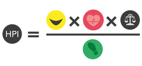
The New Economics Foundation introduced the Happy Planet Index (HPI) in 2006. It is based on:
|
 |
The emphasis here is on planet, that is, this index measures the ecological efficiency supporting well-being in various places, not the happiness per se. Unlike other measures, this one doesn't include an economic indicator. It assumes that happiness can come from non-economic factors. This index appears to support sustainable development more than others, but unfortunately the name is confusing.
 Happy Planet Index has a useful website with an interactive map and colorful graphics.
 Costa Rica currently enjoys the top spot on the index, based on life expectancy of 79.1 years, subjective well-being 7.3 / 10, 15% inequality, and 2.8 global hectares per person. Despite Costa Rica's top score, there is room for improvement:
Income inequality in Costa Rica is particularly high - in part because Costa Rica’s tax system does not effectively redistribute wealth across the population. And while Costa Rica’s commitment to environmental sustainability is impressive, its Ecological Footprint isn’t yet small enough to be completely sustainable.
No one said progress would be easy.
Better Life Index
In May 2011, the Organisation for Economic Co-operation and Development created the OECD Better Life Index. It is based on the following:
|
 |
This measure seems to be tailor-made for someone who's looking to move to a part of the world that fits them better. The home page is the best place to start exploring this treasure trove of data. Interactive maps and sliders help you either find a country that suits you best or discover what's most important to people interviewed in various countries. For example, if work-life balance is the most important thing in your life, you might find Australia a great place to live.
World Happiness Report
Just months after the creation of the OECD Better Life Index, in July 2011, the UN General Assembly adopted a resolution inviting their member countries to measure the happiness of their people and to use the data to help guide public policy. Since then, the World Happiness Report has been released nine times. The experts who produced the reports believe well-being is a useful measurement of the progress of nations.
Thomas Jefferson, who said, "The care of human life and happiness... is the sole legitimate object of good government," would likely agree. The focus of the WHR is on subjective well-being alone as a measure of happiness. However in 2021 the report introduced WELLBYs (Well-Being-Adjusted Life-Years) as a measure than incorporates both well-being and life expectancy.
The WHR official website is https://worldhappiness.report/. I couldn't find any maps or charts on the site, but I did find some interesting information on the results of the Covid pandemic so far. You can find an interactive map using this data here, and summaries and links to non-interactive maps based on the first eight versions of the report are on this site.
Years of Good Life (YoGL)
The data above are useful if you can interpret them correctly. The reason I provided links to maps and charts is because that's the only way to easily make sense of the data. An index is usually in a decimal format, somewhere between 0 and 1, and thus a computer can make sense of it but for most of us the numbers themselves are meaningless.
Not just a number
What if there was a measure that would be easily comprehensible to the average person, even without graphs and charts? That's the idea that Wolfgang Lutz and his associates came up with. Lutz is Founding Director of the Wittgenstein Centre for Demography and Global Human Capital. He and his team carefully analyzed the indexes I highlighted above and found problems with each of them. For example, The 2012 HPI report showed that Costa Rica is the top happiest country, but the HDI ranked Costa Rica 62nd in human development. Lutz asked:
How can we explain that countries which are less progressing in human development actually show better results in managing their energy consumption and act more sustainable to their environment, compared to countries that show a tremendous progress in improving their population in education, health and awareness to their environment?Lutz W, Lijadi AA, Striessnig E, Dimitrova A & Caldeira Brant de Souza Lima M (2018) Years of Good Life (YoGL): A New Indicator for Assessing Sustainable Progress. IIASA Working Paper WP-18-007. Laxenburg, Austria: International Institute for Applied Systems Analysis (IIASA).
How do you measure progress toward 17 goals, all at once?
In 2015 the UN and member states adopted the 2030 Agenda for Sustainable Development, with 17 Sustainable Development Goals (SDGs) at its core. The SDGs can be found here. According to the 2018 Lutz paper quoted above, the goal of his group was to establish a new measurement system that would make it much easier to track progress toward meeting those ambitious goals.
I took the 17 SDGs and categorized them the following way:
- Survival of humans in general and of each individual: 5 goals
- Elimination of poverty: 3 goals
- Promoting physical and cognitive health: 3 goals
- Improving subjective well-being: 3 goals
- Promoting sustainability: 3 goals
The making of a useful measure
Lutz and associates set out to create a measure of human progress, which they call Years of Good Life (YoGL), that fits the following criteria:
- It should apply equally easily to a small population or a large population.
- The number should have the same meaning regardless of whether the population it describes is large or small.
- It should measure/describe something that everyone in all cultures considers desirable.
- It should be a measure of the essentials and not try to measure everything all at once.
- It needs to be the end measure (such as life satisfaction) rather than a measure of means (such as income).
- It should be easy to understand how the number relates to real life.
For input to this calculation, they chose the five dimensions "that are considered most essential for well-being at any point in time and for any population or sub-population." They determined these five factors to be:
- Life expectancy
- Being out of poverty
- Having no serious physical disabilities
- Being cognitively enabled
- Subjective life satisfactionYoGL are basically WELLBYs with adjustments for health and poverty.
No measure is perfect
Comparing my categorization of the 17 SDGs with the five dimensions of the Lutz measure, I see obvious similarities. The obvious difference is the lack of a direct measurement of ecological impact. The Lutz paper addresses this omission by saying the YoGL indicator was designed to judge sustainability, "where developments are considered as “sustainable” if they do not lead to a decline in YoGL for any population or sub-population of interest in the longer-term future." In other words, if people aren't doing anything that results in increased poverty or reduced health or well-being, it must be sustainable.
I'm not convinced, but I'm glad they considered it.The latest update to this effort was published in March 2021: Lutz, W., Striessnig, E., Dimitrova, A., Ghislandi, W., Lijadi, A., Reiter, C., Spitzer, S., Yildiz, D. (2021). Years of Good Life (YoGL) is a well-being indicator designed to serve research on sustainability. Proceedings of the National Academy of Sciences (PNAS) [DOI: 10.1073/pnas.1907351](https://www.pnas.org/content/118/12/e1907351118) You can read their latest arguments about this point here.

What the number means
Lutz and his team may not have formulated the perfect measure of our progress as a species, but I think it's a step in the right direction. After all, unlike other measures which require a chart (and sometimes a magnifying glass) to make sense of, YoGL is expressed in simple terms: Take the percentage of people in a certain part of the world who live out of poverty, without serious cognitive or physical impairment, and consider themselves happy, and then multiply that fraction by the average life expectancy in that part of the world. You get exactly what the name suggests: A measure of the average of Years of Good Life in that part of the world.
Our new indicator, the YoGL gives an easy interpretation of the index. YoGL of 75 at birth means that the person has a chance of 75 years of good life: Out of poverty, able to read and write, in a good mental and physical shape, and overall satisfied with his or her life.

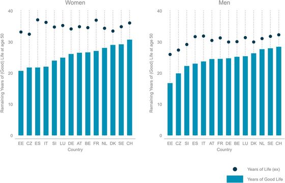
While in most developed countries, 20-year-old women can expect to have more than 50 years of good life left (with a record of 58 years in Sweden), women in the least developed countries can expect less than 15 years (with a record low of 10 years for women in Yemen). While life expectancy is higher for women than for men in every country, female Years of Good Life are lower than those of males in most developing countries. This reveals a significant gender inequality in objective living conditions and subjective life satisfaction in most of these countries.
Putting it all together
I'd be lying if I said the future of the human race looks bright right now. But there's no need to give up and put our heads in the sand. There are things we can all do, individually and collectively, to make a difference. I'll be touching on some of those things in the future, because sometimes we need our high beams to see ahead of us.
Having one indicator to measure everything would be ideal, but it's not realistic to expect to find one. Just as we don't have one measurement that can say everything about the health of an individual, we don't have just one measure to tell us everything about the health of our species or of the world in general. But the efforts of these groups are bringing us closer than before to being able to understand the challenges that we need to face.
Rather than end on that somber note, how about some good news? According to World Happiness Report, from 2006-08 to 2017-19, life expectancy worldwide increased by 3.7 years. That's huge. Life expectancy in Sub-Saharan Africa went up by 7 percent during that period. While the Covid19 pandemic in the last year has reversed some of those gains, we're still ahead.
Let's keep our heads up and stay on the watch for a bright future. But let's not forget to check the meters on the dashboard from time to time.